The problem
Dedebit's customers were used to a branch and a teller. Asking them to move money from a phone meant designing for people with real reasons not to trust the screen — and often on modest devices and patchy connections.
What I did
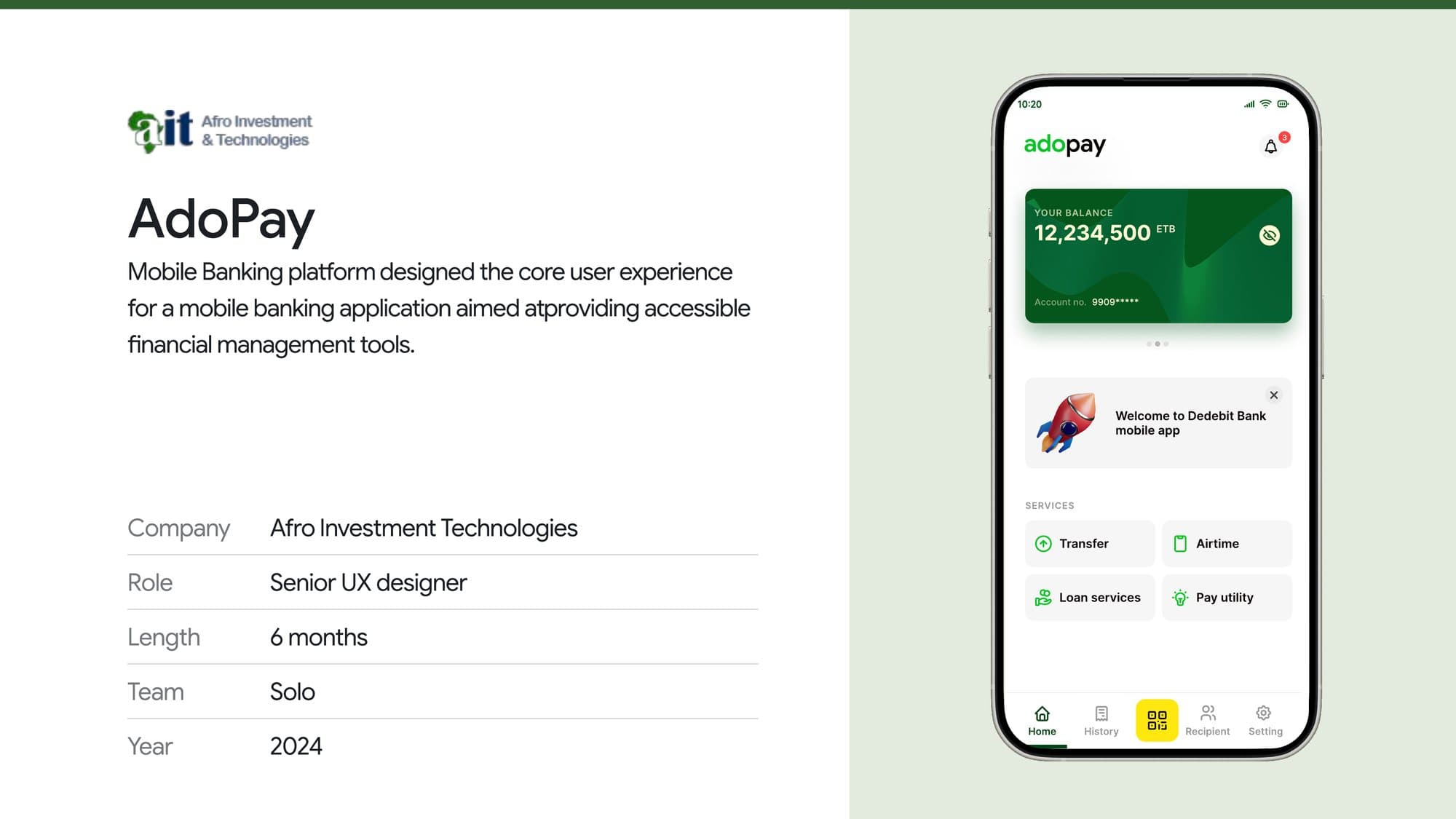
- Put balance, transfer and history within one tap of opening the app, because those are the three things people actually came for.
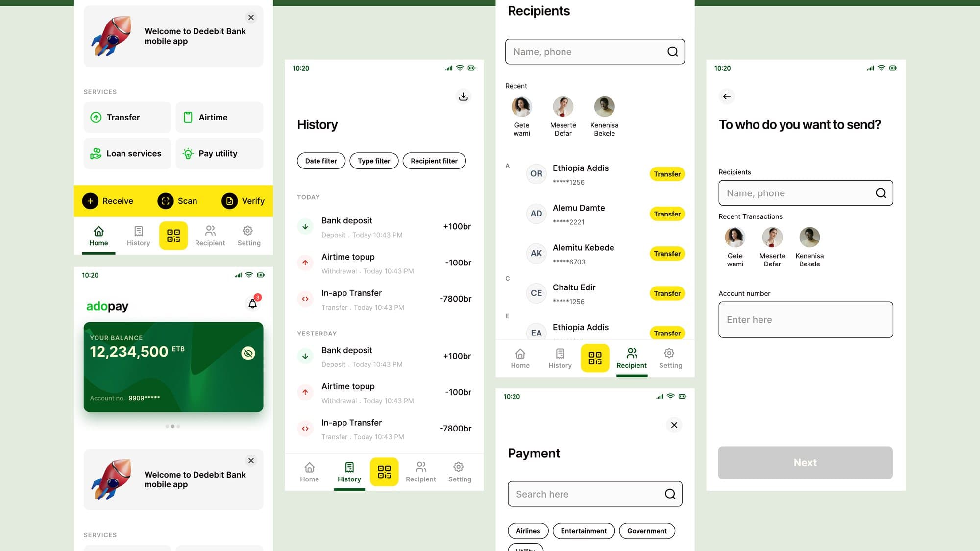
- Designed transfers around recipients rather than account numbers — recent contacts surfaced first, with the account number as fallback rather than the default.
- Kept destructive and irreversible steps behind clear confirmation, and made transaction history legible enough to be its own reassurance.
- Held to large touch targets, high-contrast typography and plain-language labels throughout, and delivered pixel-perfect handoff to the engineering team.
Outcome
A mobile banking experience built for first-time digital customers, covering transfers, airtime, loan services and utility payments in one accessible app.
6 mo
Concept to handoff
4
Core service flows
1
Designer